Note
Access to this page requires authorization. You can try signing in or changing directories.
Access to this page requires authorization. You can try changing directories.
This article describes the email theme functionality to customize the appearance of email fields, buttons, and text.
Note
Unless a style is explicitly set in the element properties, the default style is replaced with the email theme style.
What is the theme functionality?
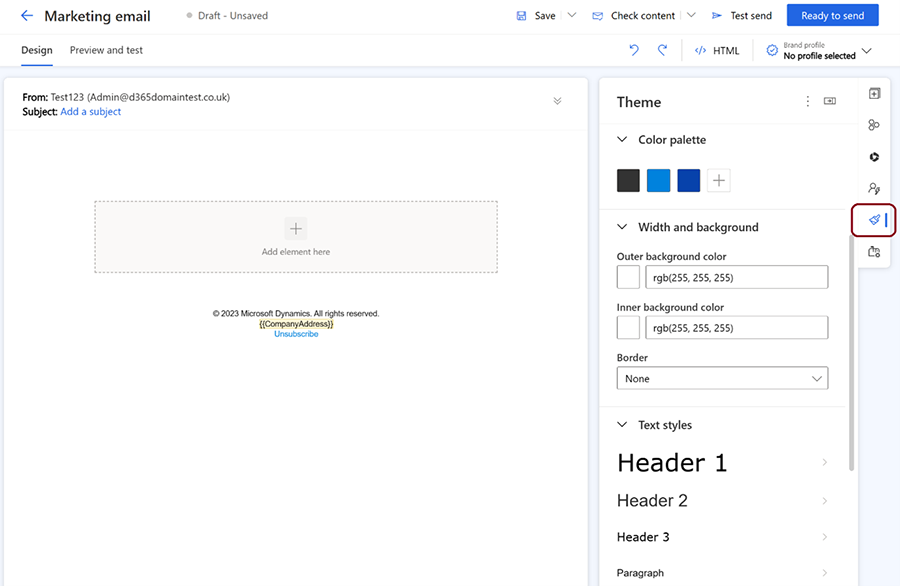
Theme allows you to control the style of your email elements such as fields, buttons, and text. You can access the theme feature by selecting the brush icon in the right pane of the email designer. Theme applies the same style to all elements of the same type in your email. For example, if you change the color of a text field, all text fields in your email change to the same color.
Edit email element styles using the theme functionality
To edit the style of email elements, select the theme (brush) icon in the right pane, then select the element type from the theme section. Choose from input fields, buttons, text, labels, or error messages. Once you select an element type, customize its properties such as font, color, size, border, and background. You can preview the changes in the email editor.
